Bitcoin Magazine Pro
What is the Bitcoin Puell Multiple Indicator and How Does It Work?
Published
5 days agoon
By
admin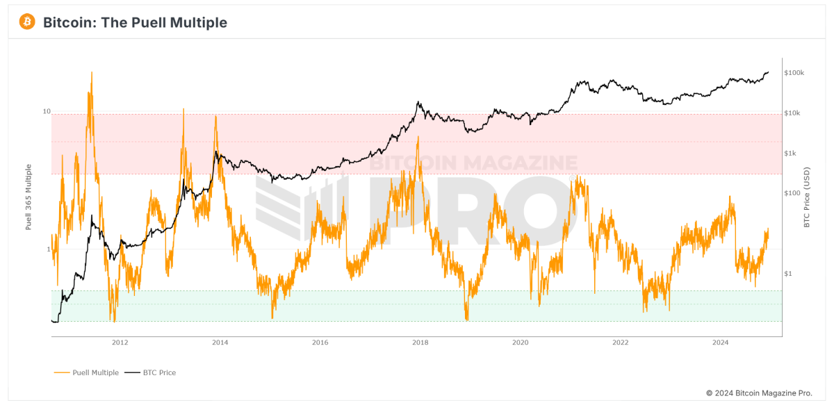
In the world of Bitcoin investing, understanding market cycles is key to identifying buying opportunities and spotting potential price peaks. One indicator that has stood the test of time in this regard is the Puell Multiple. Originally created by David Puell, this metric examines Bitcoin’s valuation through the lens of miner revenue, offering insights into whether Bitcoin might be undervalued or overvalued compared to its historical norms.
This article will explain what the Puell Multiple is, how to interpret it, and what the current reading on the chart suggests for investors. For a real-time look at this tool, check out the Puell Multiple chart on Bitcoin Magazine Pro.

What is the Puell Multiple?
The Puell Multiple is an indicator that compares Bitcoin miners’ daily revenue to its long-term average. Miners, as the “supply side” of Bitcoin’s economy, must sell portions of their BTC rewards to cover operational costs like energy and hardware. This makes miner revenue a critical factor influencing Bitcoin’s price dynamics.
How is the Puell Multiple Calculated?
The formula is simple:
Puell Multiple = Daily Issuance Value of BTC (in USD) ÷ 365-Day Moving Average of Daily Issuance Value
By comparing current miner revenues to their yearly average, the Puell Multiple identifies periods where miner profits are unusually high or low, signaling potential market tops or bottoms.
How to Read the Puell Multiple Chart
The Puell Multiple chart uses color zones to make interpretation straightforward:
- Red Zone (Overvaluation)
- When the Puell Multiple enters the red zone (above 3.4), it suggests miner revenues are significantly higher than usual.
- Historically, this has coincided with Bitcoin price peaks, indicating potential overvaluation.
- Green Zone (Undervaluation)
- When the Puell Multiple drops into the green zone (below 0.5), it signals that miner revenues are unusually low.
- These periods have historically aligned with Bitcoin market bottoms, offering prime buying opportunities.
- Neutral Zone
- When the Puell Multiple hovers between these levels, Bitcoin’s price is typically in a steady range relative to historical norms.
Current Insights: What is the Puell Multiple Telling Us?
Looking at the current Puell Multiple chart from Bitcoin Magazine Pro:
- The Puell Multiple (orange line) is trending upward but remains well below the red overvaluation zone.
- This suggests that Bitcoin is not yet in an overheated phase, where prices historically peak.
- At the same time, the metric is far above the green undervaluation zone, signaling we are no longer in a market bottom phase.
What Does This Mean for Investors?
The current Puell Multiple reading points to Bitcoin being in a mid-market cycle:
- Bullish Momentum: With the metric rising steadily, the market appears to be moving into a bullish phase, though it remains far from “overheated.”
- No Immediate Peak: The lack of a red zone reading suggests there may still be room for upside growth before a major correction.
Investors should monitor this chart closely in the coming months, particularly as Bitcoin approaches its next halving event in 2028, which could further influence miner revenues.
Why the Puell Multiple Matters for Bitcoin Investors
The Puell Multiple offers a unique perspective on Bitcoin’s market cycles by focusing on the supply side (miner revenue), rather than just demand. For long-term investors, this tool can be valuable for:
- Identifying Buying Opportunities: The green zone highlights periods of undervaluation.
- Spotting Market Peaks: The red zone has historically aligned with major price tops.
- Navigating Market Cycles: Combining the Puell Multiple with other indicators can help investors time their entries and exits more strategically.
Stay Ahead of the Market with Bitcoin Magazine Pro
For professional investors and Bitcoin enthusiasts looking to deepen their analysis, tools like the Puell Multiple chart on Bitcoin Magazine Pro provide essential insights into Bitcoin’s valuation trends.
By understanding the Puell Multiple and its historical significance, you can make informed decisions and better navigate Bitcoin’s unique market cycles.
Disclaimer: This article is for informational purposes only and does not constitute financial advice. Always conduct your own research before making investment decisions.
Source link
You may like


Metaplanet makes largest Bitcoin bet, acquires nearly 620 BTC


Tron’s Justin Sun Offloads 50% ETH Holdings, Ethereum Price Crash Imminent?


Investors bet on this $0.0013 token destined to leave Cardano and Shiba Inu behind


End of Altcoin Season? Glassnode Co-Founders Warn Alts in Danger of Lagging Behind After Last Week’s Correction


Can Pi Network Price Triple Before 2024 Ends?


XRP’s $5, $10 goals are trending, but this altcoin with 7,400% potential takes the spotlight
Bitcoin Magazine Pro
Exploring Six On-Chain Indicators to Understand the Bitcoin Market Cycle
Published
2 days agoon
December 21, 2024By
admin
With Bitcoin now making six-figure territory feel normal and higher prices a seeming inevitability, the analysis of key on-chain data provides valuable insights into the underlying health of the market. By understanding these metrics, investors can better anticipate price movements and prepare for potential market peaks or even any upcoming retracements.
Terminal Price
The Terminal Price metric, which incorporates the Coin Days Destroyed (CDD) while factoring in Bitcoin’s supply, has historically been a reliable indicator for predicting Bitcoin cycle peaks. Coin Days Destroyed measures the velocity of coins being transferred, considering both the holding duration and the quantity of Bitcoin moved.
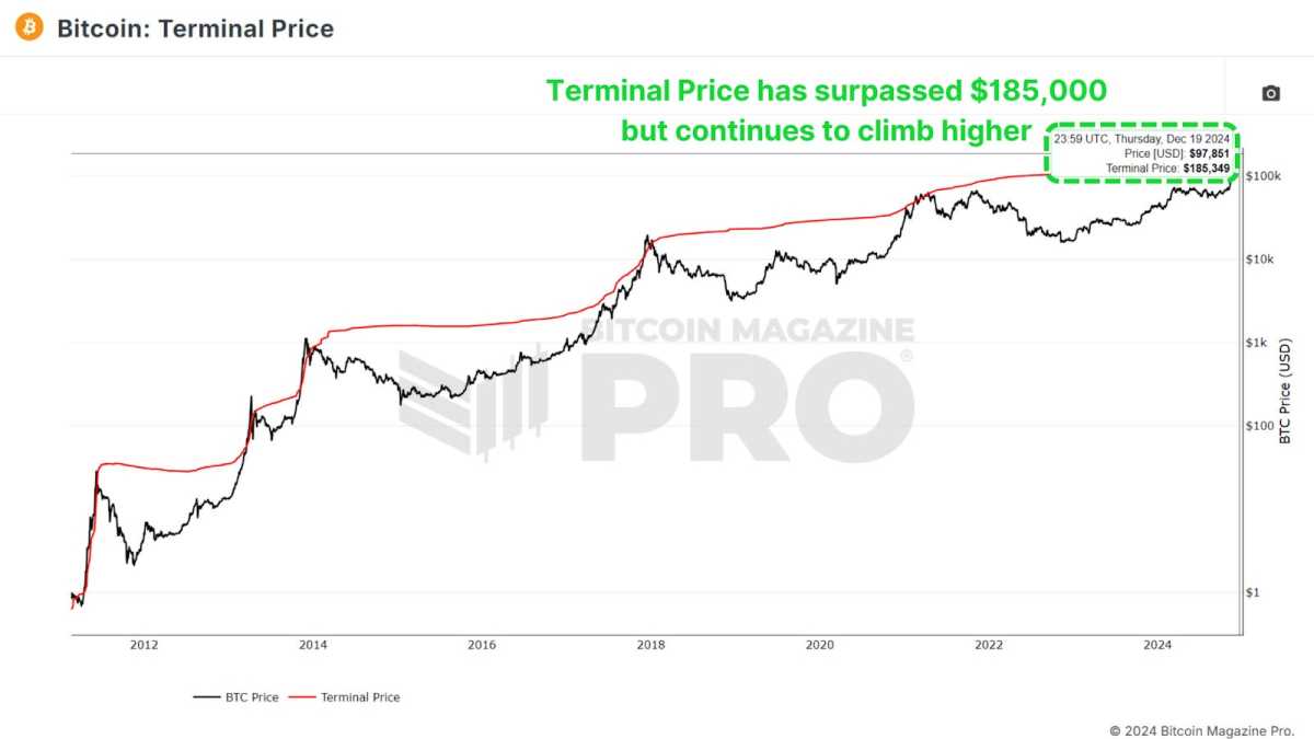
Currently, the terminal price has surpassed $185,000 and is likely to rise toward $200,000 as the cycle progresses. With Bitcoin already breaking $100,000, this suggests we may still have several months of positive price action ahead.
Puell Multiple
The Puell Multiple evaluates daily miner revenue (in USD) relative to its 365-day moving average. After the halving event, miners experienced a sharp drop in revenue, creating a period of consolidation.
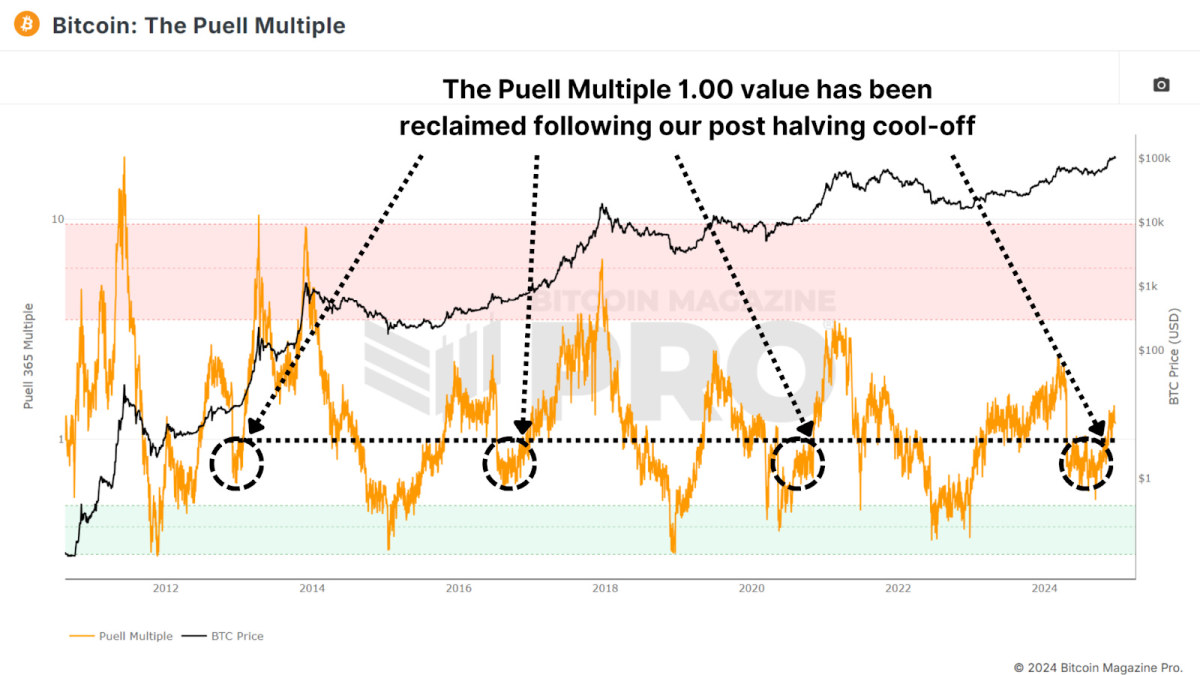
Now, the Puell Multiple has climbed back above 1, signaling a return to profitability for miners. Historically, surpassing this threshold has indicated the later stages of a bull cycle, often marked by exponential price rallies. A similar pattern was observed during all previous bull runs.
MVRV Z-Score
The MVRV Z-Score measures the market value relative to the realized value (average cost basis of Bitcoin holders). Standardized into a Z-Score to account for the asset’s volatility, it’s been highly accurate in identifying cycle peaks and bottoms.
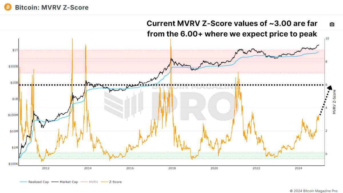
Currently, Bitcoin’s MVRV Z-Score remains below the overheated red zone with a value of around 3.00, signaling that there’s still room for growth. While diminishing peaks have been a trend in recent cycles, the Z-Score suggests that the market is far from reaching a euphoric top.
Active Address Sentiment
This metric tracks the 28-day percentage change in active network addresses alongside the price change over the same period. When price growth outpaces network activity, it suggests the market may be short-term overbought, as the positive price action may not be sustainable given network utilization.
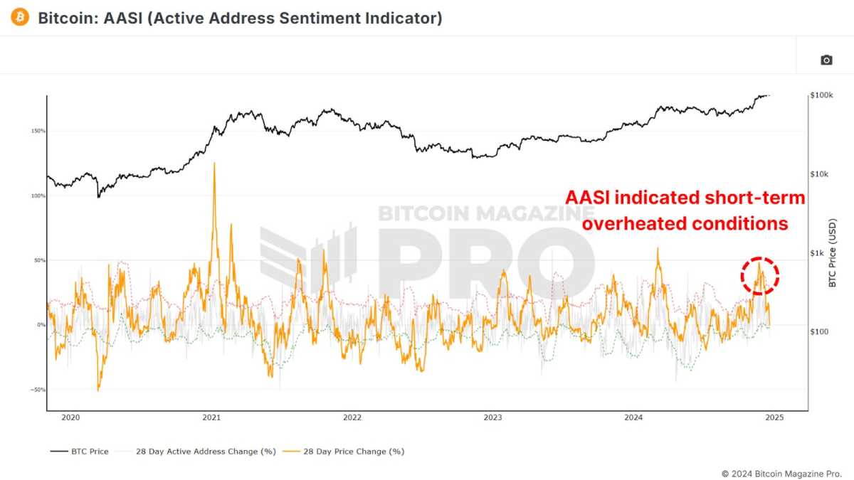
Recent data shows a slight cooling after Bitcoin’s rapid climb from $50,000 to $100,000, indicating a healthy consolidation period. This pause is likely setting the stage for sustained long-term growth and does not indicate we should be medium to long-term bearish.
Spent Output Profit Ratio
The Spent Output Profit Ratio (SOPR) measures realized profits from Bitcoin transactions. Recent data shows an uptick in profit-taking, potentially indicating we are entering the latter stages of the cycle.
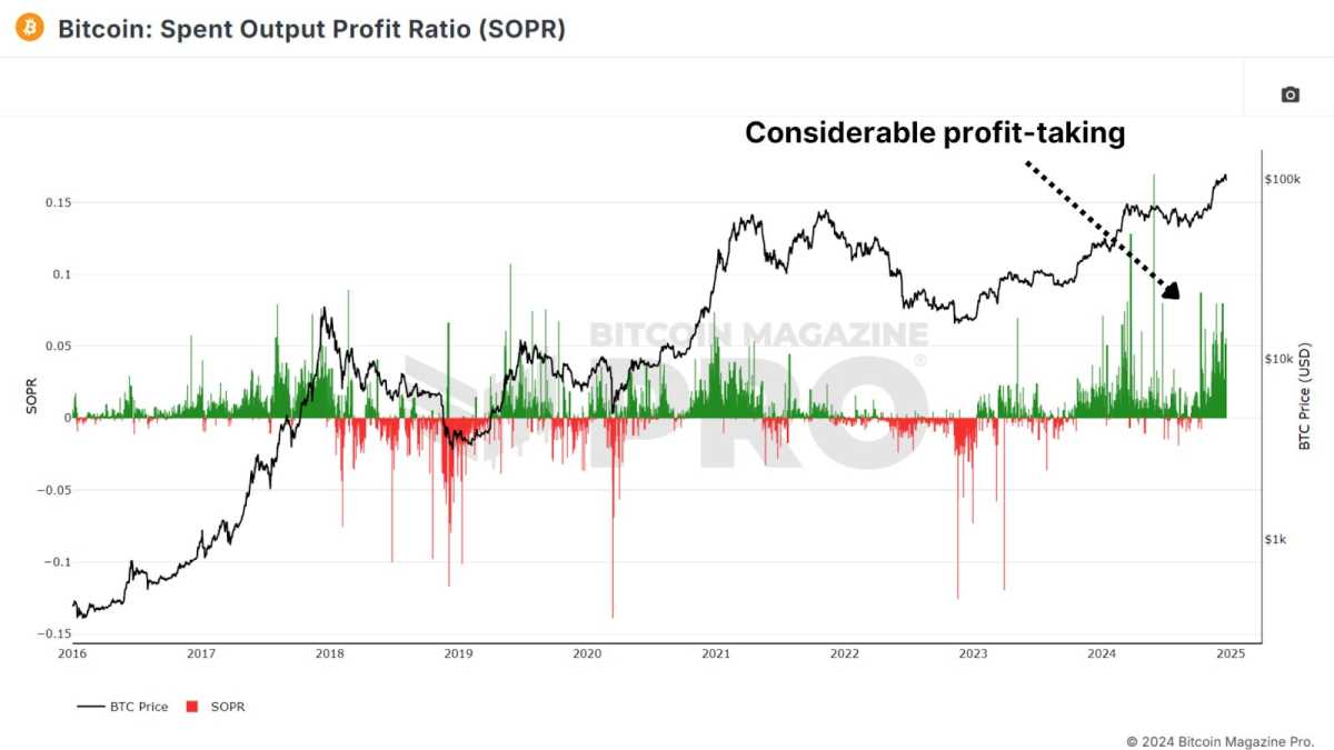
One caveat to consider is the growing use of Bitcoin ETFs and derivative products. Investors may be shifting from self-custody to ETFs for ease of use and tax advantages, which could influence SOPR values.
Value Days Destroyed
Value Days Destroyed (VDD) Multiple expands on CDD by weighting larger, long-term holders. When this metric enters the overheated red zone, it often signals major price peaks as the market’s largest and most experienced participants begin cashing out.
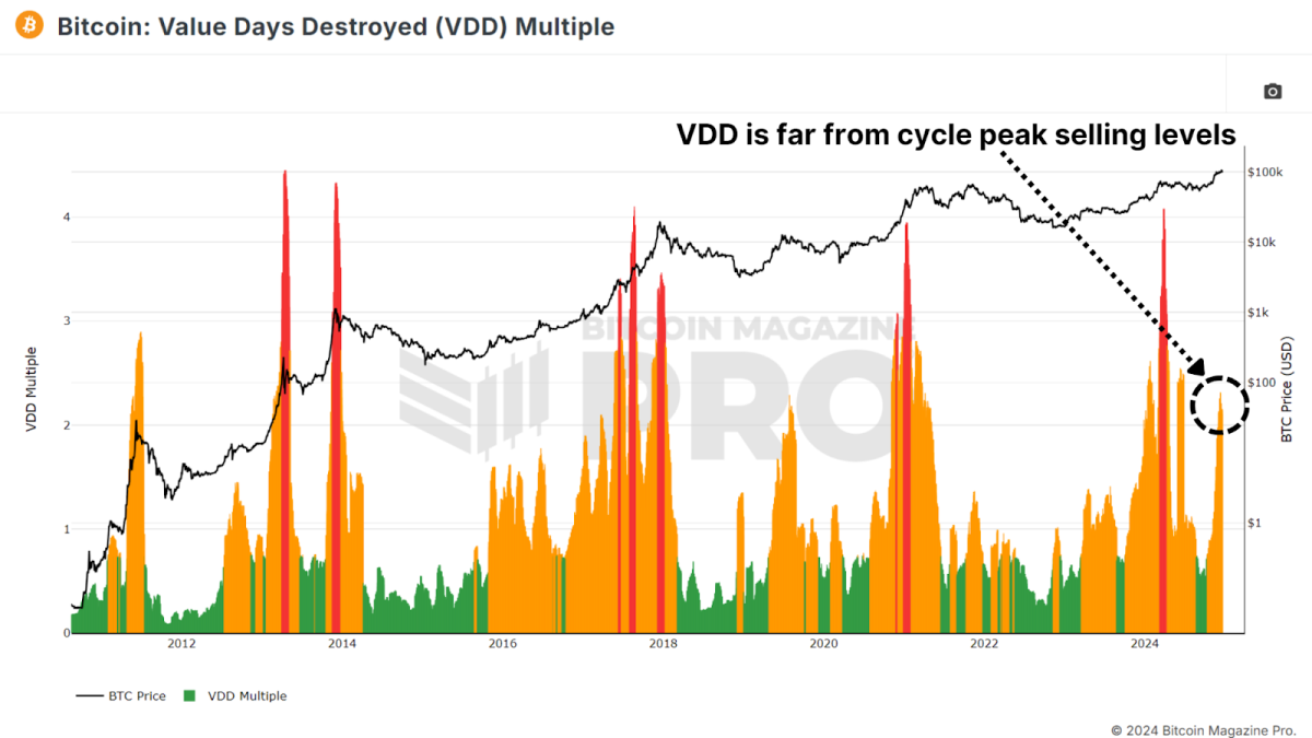
While Bitcoin’s current VDD levels indicate a slightly overheated market, history suggests it could sustain this range for months before a peak. For example, in 2017, VDD indicated overbought conditions nearly a year before the cycle’s top.
Conclusion
Taken together, these metrics suggest that Bitcoin is entering the latter stages of its bull market. While some indicators point to short-term cooling or slight overextension, most highlight substantial remaining upside throughout 2025. Key resistance levels for this cycle may emerge between $150,000 and $200,000, with metrics like SOPR and VDD providing clearer signals as we approach the peak.
For a more in-depth look into this topic, check out a recent YouTube video here: What’s Happening On-chain: Bitcoin Update
Disclaimer: This newsletter is for informational purposes only and should not be considered financial advice. Always do your own research before making any investment decisions.
Source link
Bitcoin Magazine Pro
Exploring Five On-Chain Indicators to Understand the Bitcoin Market Cycle
Published
3 days agoon
December 20, 2024By
admin
With Bitcoin now making six-figure territory feel normal and higher prices a seeming inevitability, the analysis of key on-chain data provides valuable insights into the underlying health of the market. By understanding these metrics, investors can better anticipate price movements and prepare for potential market peaks or even any upcoming retracements.
Terminal Price
The Terminal Price metric, which incorporates the Coin Days Destroyed (CDD) while factoring in Bitcoin’s supply, has historically been a reliable indicator for predicting Bitcoin cycle peaks. Coin Days Destroyed measures the velocity of coins being transferred, considering both the holding duration and the quantity of Bitcoin moved.

Currently, the terminal price has surpassed $185,000 and is likely to rise toward $200,000 as the cycle progresses. With Bitcoin already breaking $100,000, this suggests we may still have several months of positive price action ahead.
Puell Multiple
The Puell Multiple evaluates daily miner revenue (in USD) relative to its 365-day moving average. After the halving event, miners experienced a sharp drop in revenue, creating a period of consolidation.

Now, the Puell Multiple has climbed back above 1, signaling a return to profitability for miners. Historically, surpassing this threshold has indicated the later stages of a bull cycle, often marked by exponential price rallies. A similar pattern was observed during all previous bull runs.
MVRV Z-Score
The MVRV Z-Score measures the market value relative to the realized value (average cost basis of Bitcoin holders). Standardized into a Z-Score to account for the asset’s volatility, it’s been highly accurate in identifying cycle peaks and bottoms.

Currently, Bitcoin’s MVRV Z-Score remains below the overheated red zone with a value of around 3.00, signaling that there’s still room for growth. While diminishing peaks have been a trend in recent cycles, the Z-Score suggests that the market is far from reaching a euphoric top.
Active Address Sentiment
This metric tracks the 28-day percentage change in active network addresses alongside the price change over the same period. When price growth outpaces network activity, it suggests the market may be short-term overbought, as the positive price action may not be sustainable given network utilization.

Recent data shows a slight cooling after Bitcoin’s rapid climb from $50,000 to $100,000, indicating a healthy consolidation period. This pause is likely setting the stage for sustained long-term growth and does not indicate we should be medium to long-term bearish.
Spent Output Profit Ratio
The Spent Output Profit Ratio (SOPR) measures realized profits from Bitcoin transactions. Recent data shows an uptick in profit-taking, potentially indicating we are entering the latter stages of the cycle.

One caveat to consider is the growing use of Bitcoin ETFs and derivative products. Investors may be shifting from self-custody to ETFs for ease of use and tax advantages, which could influence SOPR values.
Value Days Destroyed
Value Days Destroyed (VDD) Multiple expands on CDD by weighting larger, long-term holders. When this metric enters the overheated red zone, it often signals major price peaks as the market’s largest and most experienced participants begin cashing out.

While Bitcoin’s current VDD levels indicate a slightly overheated market, history suggests it could sustain this range for months before a peak. For example, in 2017, VDD indicated overbought conditions nearly a year before the cycle’s top.
Conclusion
Taken together, these metrics suggest that Bitcoin is entering the latter stages of its bull market. While some indicators point to short-term cooling or slight overextension, most highlight substantial remaining upside throughout 2025. Key resistance levels for this cycle may emerge between $150,000 and $200,000, with metrics like SOPR and VDD providing clearer signals as we approach the peak.
For a more in-depth look into this topic, check out a recent YouTube video here: What’s Happening On-chain: Bitcoin Update
Disclaimer: This newsletter is for informational purposes only and should not be considered financial advice. Always do your own research before making any investment decisions.
Source link
Bitcoin
Mathematically Predicting the Bitcoin Price Bull Cycle Peak
Published
5 days agoon
December 18, 2024By
admin

The Bitcoin bull market is heating up, and investors are eagerly searching for data-driven insights into when the next Bitcoin price peak could occur and how high Bitcoin may climb. In a recent analysis video published by Bitcoin Magazine Pro, lead analyst Matt Crosby meticulously crunched the numbers to provide a mathematically backed forecast for Bitcoin’s next bull cycle peak.
By combining historical patterns, moving averages, and diminishing returns, Crosby’s research highlights August 24, 2025, as a critical date—projecting a price range of $256,000 to $310,000 for Bitcoin.
Watch the Full Analysis
To explore the detailed mathematical breakdown and see how Matt Crosby arrives at these projections, watch the full video analysis here.
The Pi Cycle Top Indicator: A Historical Compass
Crosby begins his analysis with the Pi Cycle Top Indicator, a tool famed for its accuracy in predicting Bitcoin’s price peaks within just a few days during previous bull markets. The indicator uses two moving averages:
- The 111-day moving average (111DMA).
- The 350-day moving average (350DMA) multiplied by two.
The “Pi” connection arises from the mathematical ratio between these numbers, approximating 3.142. Historically, when the 111DMA crosses above the doubled 350DMA, Bitcoin has hit its market cycle top:
- 2017: Predicted the peak within 1 day.
- 2021: Called the exact day of the price cycle peak.
Turning Data Into Predictions
To project the next peak, Crosby introduces the Pi Cycle Oscillator, which quantifies how close the two moving averages are to crossing. Using Bitcoin Magazine Pro’s raw data API, Crosby calculated:
- The rate of change for the moving averages.
- Current trends starting from November 16, 2023, when the oscillator began a new upward trajectory.
Assuming the current trend holds, the two averages are set to cross on August 24, 2025, marking the likely bull cycle peak date.
What About the Price?
To estimate Bitcoin’s price at this projected peak, Crosby examines historical patterns of diminishing returns—a phenomenon where Bitcoin’s price peaks are proportionally smaller with each cycle:
- In 2013, Bitcoin’s price was 440% above the moving averages.
- In 2017, it dropped to 299% above.
- In 2021, it shrank further to 32% above.
By extrapolating this trend, Crosby provides a range of potential price outcomes:
- If returns diminish to 28% above the moving averages (consistent with prior cycles), Bitcoin could peak at $310,000.
- If returns continue to shrink at a faster rate, the peak could land closer to $256,700.
Why This Matters for Investors
Crosby emphasizes that no analysis is perfect, and trends evolve as new market dynamics emerge. Institutional adoption, macroeconomic factors, and unexpected events could all reshape this trajectory. However, his analysis offers a valuable data-driven roadmap for investors navigating the current bull market.
As the next cycle unfolds, these predictions will become increasingly precise—providing opportunities for investors to optimize their strategies.
Key Takeaways:
- Date Prediction: August 24, 2025.
- Peak Price Range: Between $256,000 and $310,000.
- Indicator: Pi Cycle Top and Bottom Oscillator, powered by Bitcoin Magazine Pro data.
For access to live data, powerful indicators, and more exclusive content, visit BitcoinMagazinePro.com.
Disclaimer: This article is for informational purposes only and does not constitute financial advice. Always conduct your own research before making investment decisions.
Source link

Metaplanet makes largest Bitcoin bet, acquires nearly 620 BTC

Tron’s Justin Sun Offloads 50% ETH Holdings, Ethereum Price Crash Imminent?

Investors bet on this $0.0013 token destined to leave Cardano and Shiba Inu behind

End of Altcoin Season? Glassnode Co-Founders Warn Alts in Danger of Lagging Behind After Last Week’s Correction

Can Pi Network Price Triple Before 2024 Ends?

XRP’s $5, $10 goals are trending, but this altcoin with 7,400% potential takes the spotlight

CryptoQuant Hails Binance Reserve Amid High Leverage Trading

Trump Picks Bo Hines to Lead Presidential Crypto Council

The introduction of Hydra could see Cardano surpass Ethereum with 100,000 TPS

Top 4 Altcoins to Hold Before 2025 Alt Season

DeFi Protocol Usual’s Surge Catapults Hashnote’s Tokenized Treasury Over BlackRock’s BUIDL

DOGE & SHIB holders embrace Lightchain AI for its growth and unique sports-crypto vision

Will Shiba Inu Price Hold Critical Support Amid Market Volatility?

Chainlink price double bottoms as whales accumulate

Ethereum Accumulation Address Holdings Surge By 60% In Five Months – Details
182267361726451435

Why Did Trump Change His Mind on Bitcoin?

Top Crypto News Headlines of The Week

New U.S. president must bring clarity to crypto regulation, analyst says

Will XRP Price Defend $0.5 Support If SEC Decides to Appeal?

Bitcoin Open-Source Development Takes The Stage In Nashville

Ethereum, Solana touch key levels as Bitcoin spikes

Bitcoin 20% Surge In 3 Weeks Teases Record-Breaking Potential

Ethereum Crash A Buying Opportunity? This Whale Thinks So

Shiba Inu Price Slips 4% as 3500% Burn Rate Surge Fails to Halt Correction

Washington financial watchdog warns of scam involving fake crypto ‘professors’

‘Hamster Kombat’ Airdrop Delayed as Pre-Market Trading for Telegram Game Expands

Citigroup Executive Steps Down To Explore Crypto
Mostbet Güvenilir Mi – Casino Bonus 2024

NoOnes Bitcoin Philosophy: Everyone Eats
Trending

 3 months ago
182267361726451435

 Donald Trump5 months ago
Why Did Trump Change His Mind on Bitcoin?

 24/7 Cryptocurrency News4 months ago
Top Crypto News Headlines of The Week

 News4 months ago
New U.S. president must bring clarity to crypto regulation, analyst says

 Price analysis4 months ago
Will XRP Price Defend $0.5 Support If SEC Decides to Appeal?

 Opinion5 months ago
Bitcoin Open-Source Development Takes The Stage In Nashville

 Bitcoin5 months ago
Ethereum, Solana touch key levels as Bitcoin spikes

 Bitcoin5 months ago
Bitcoin 20% Surge In 3 Weeks Teases Record-Breaking Potential


